Internet, meet the Lavender Trim Living Room.
Otherwise known as the Gag Me With a Spoon Egads It’s So Lavender Living Room.
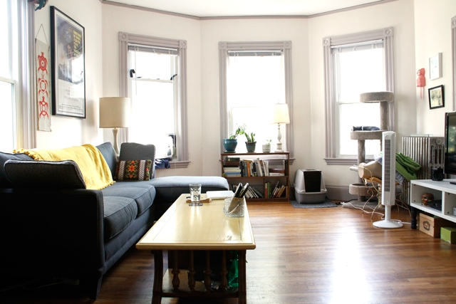
Don’t be fooled by the Lavender Trim’s clever disguise in these photos: it is not a soft dove grey-lavender. It is LAVENDER. Gross, fluffy 80s chiffon bridesmaids’ dress LAVENDER. And I hate it.
Who would paint trim LAVENDER? Who were these sacrilegious former tenants? It’s nothing against the color itself. It just has no business being on trim. Beautiful original ornate 1900s trim should be WOOD or WHITE.
Moving on.
There’s some other issues here. Beigey walls. Too many nail holes. The new AC unit which we hastily and sweatily installed during heat wave 3 (or was it 4? I’m losing track), and then lazily “insulated” with rags and foam the next day. The stuff that’s been displaced by the AC and hasn’t found a new home.
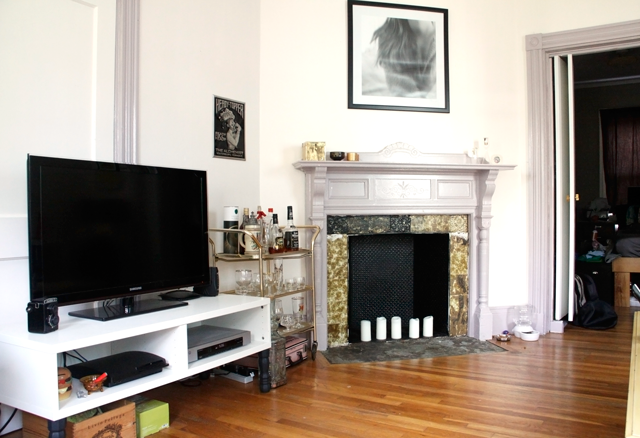
And the fireplace. So lavender. So fake-slatey. So surrounded by painted-over then badly uncovered tiles. So sad.
I’ve got great plans for her though. Involving tin ceiling tiles and an extra helping of awesomesauce. Plans which I may or may not get to since my project list grows exponentially with every Pinterest visit.
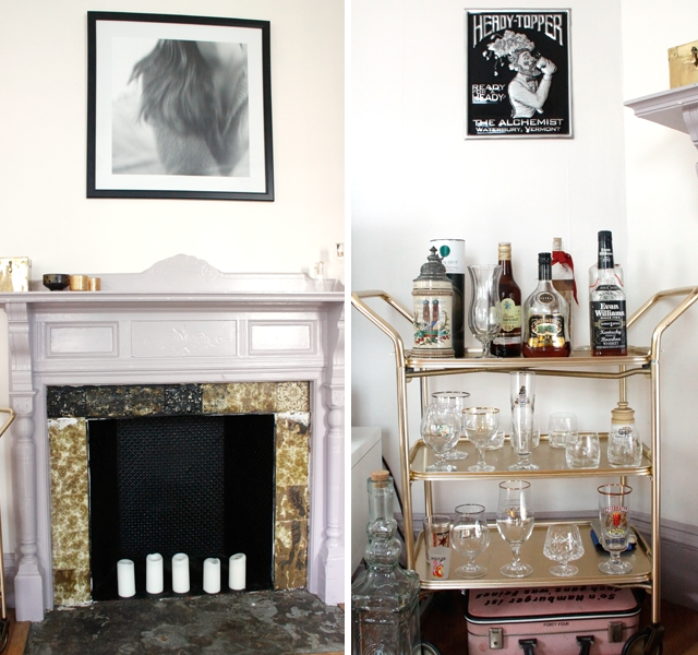
On the bright side, we have a charming bar cart!
So that’s the living room. It’s nice, and homey, but it’s got a long way to go before I would dare to say it emproudens me. (Alan’s friend just made that word up. I’m digging it).
What design woes do you all struggle with in your homes? Any good contenders for Apartment Therapy’s upcoming Style Cure?
Haha, people make such weird painting choices. My place was painted a nice cream color before I saw it for the first time, but apparently had a dark gray hallway (ah, how welcoming?), a green and red bathroom and other color nightmares. Apart from the previously awful paint colors, my biggest struggle is that I have a decently sized kitchen that has ONLY 4 FEET of counter space! I’m actively working on figuring out a solution for that right now!
-Becca
Ladyface Blog
The green and red bathroom sounds pretty terrible, but I can top your kitchen woes–we have NO counters! It is large enough for a table so we use that as a workspace, but still. I’ll be posting a tour of that soon. Thanks for stopping by!
Ya, I feel your pain. Trim really should be white of some sort. Lavender is wrong – but you make it look cute and eclectic!
Aww, thank you, that is really sweet!
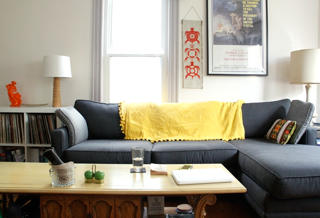
I love the movie poster theme. What kind of frame is that? I always wanted to hang up of few, but the frames cost an arms and a leg!
Thank you, Peter! Frames really can get pricey! I found the one for my boyfriend’s “Day of the Dolphin” poster at Ikea. I believe it’s this one: http://www.ikea.com/us/en/catalog/products/30132527/
It uses acrylic instead of glass, but you can’t tell and that makes the frame a bit lighter too. I’ve heard you can also get inexpensive poster frames at The Christmas Tree Shops, though I haven’t checked this resource myself.
Ooo, that’s not too bad. But I wanted to put up 5-10. Literally make the place look like a theater. I’m apprehensive on buying the cheap ones on Amazon for like $9-12 because they seem quite flimzy. Is that one stable?
It is stable! I mean, when you’re handling it you can tell the difference between that and the custom-made frame I bought for the black and white print over the fireplace from a real framing shop, but it is definitely stable.
Great! Thanks for the tip!